Aylesbury Prison

The brief:
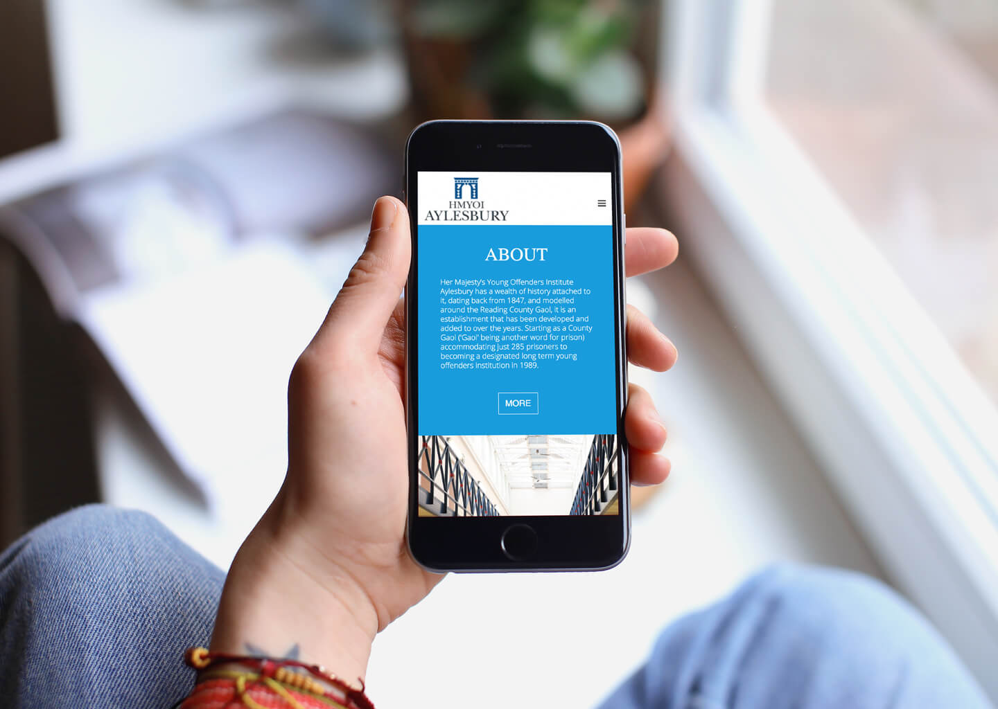
Aylesbury Prison wanted to interact with the local community, to cultivate a positive perception and attract forward thinking and confident personnel, but it had no identity of its own, and no web presence.
A strong, professional and authoritative visual identity was needed to recognise the undeniable truths that come with a prison: incarceration, barriers/walls, loss of freedom and safety for the public, but also (and maybe less addressed) positives such as education, support, rehabilitation and new starts.
The new identity had to tie in with the existing national HMPPS campaign and work across printed and digital media.
The solution:
I believed that shying away from what could be perceived as negative iconography – walls, detention, establishment – would be a mistake and that those truths should be embraced and presented in a manner that would help breed positive attitudes towards a necessary negative.
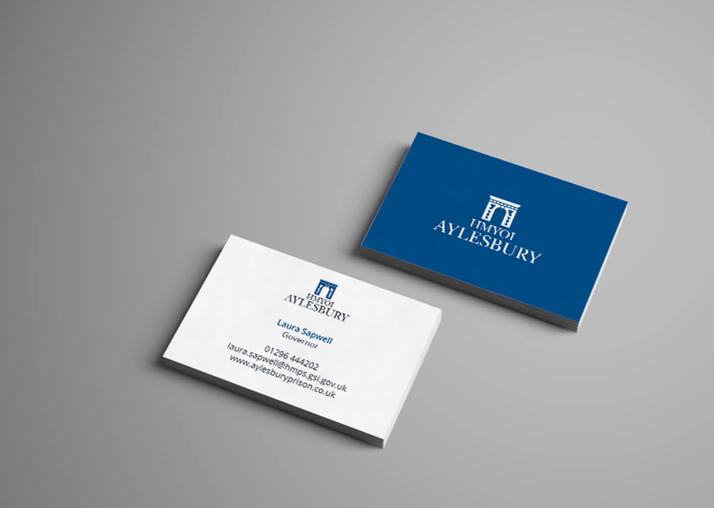
The icon is a much simplified and stylised representation of the main entrance to Aylesbury Prison – a very prominent feature that many will already associate with the establishment. The arch commands authority and suggests strength and control but also freedom: the use of negative space creating a passageway, NOT a gate, and thus represents an exit just as much as an entrance: suggesting its not a one way journey.
The serif font suggests professionalism and establishment, while the stacked, crest like nature of the whole design adds a sense of traditionalism, which ties in nicely with the prison services’ own branding, and the bold single colour style of the icon lends itself perfectly to use as a social media icon.
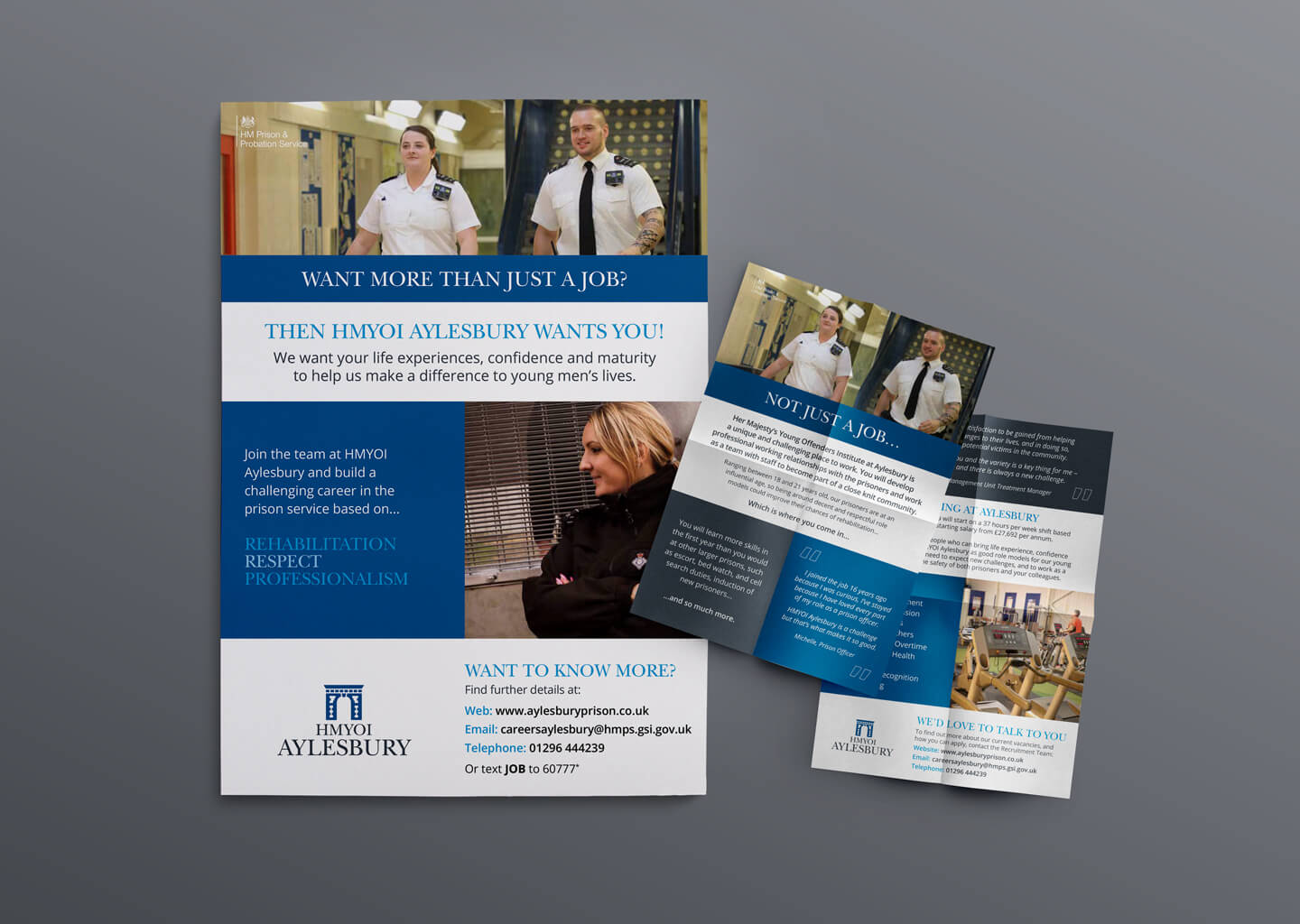
The solid blocky style of the marketing materials echo’s the style of the existing HMPPS materials, giving Aylesbury Prison its own local voice whilst still tying in with national communications.
Although we were not sure what we wanted, Stuart took the creative brief and delivered exactly what we needed. Grasping the concept of what we wanted with ease, he broke everything down, explained the theories behind his concepts, and brought our basic idea to life. We now have a professional suite of marketing materials for HMYOI Aylesbury and, more importantly, a solid brand image… and all done with a great attitude.
