Guard Environmental Consultancy
The brief:
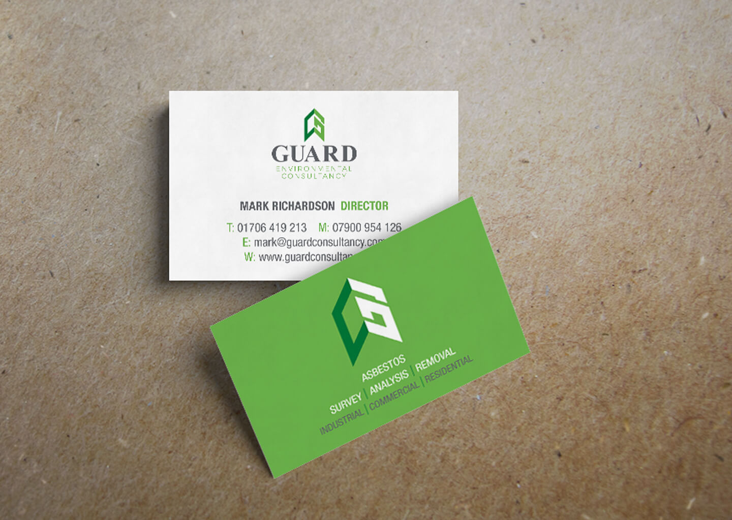
Guard Environmental Consultancy, a newly established asbestos management business, were not happy with their original logo design and so tasked me with creating a better one. Their only stipulations were that green was used as a link to the environmental aspect of the business, and they didn’t want too strong an association with ‘Guard’ in fear of the nature of the business being misunderstood as a security provider.
The solution:
Starting completely anew, a crest style logo was created, using an isometric ‘G’ to represent the business name, whilst also promoting a positive tone with the resulting upward pointing arrow. A serif font was used to give a traditional, established tone, with grey complimenting the two tone green.
The ‘G’ icon also stands alone as a social media icon.
Stu did a fantastic job creating our logo and business cards. He sent over lots of ideas which was brilliant for me as I love choice. I would very much recommend him to anyone wanting a bespoke logo and a good service.
Mark Richardson, Director
