Gubblecote
The brief:
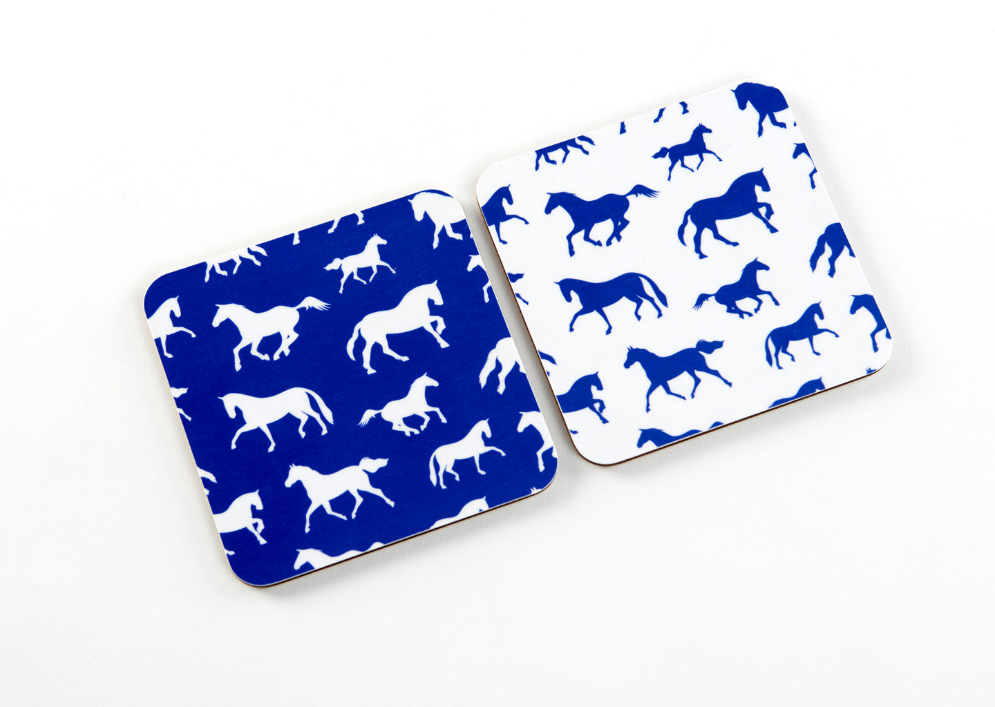
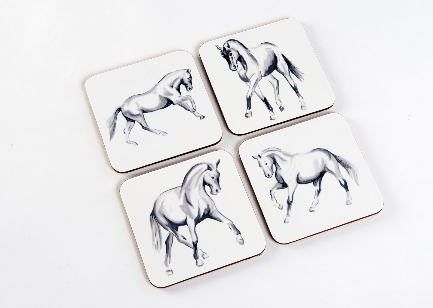
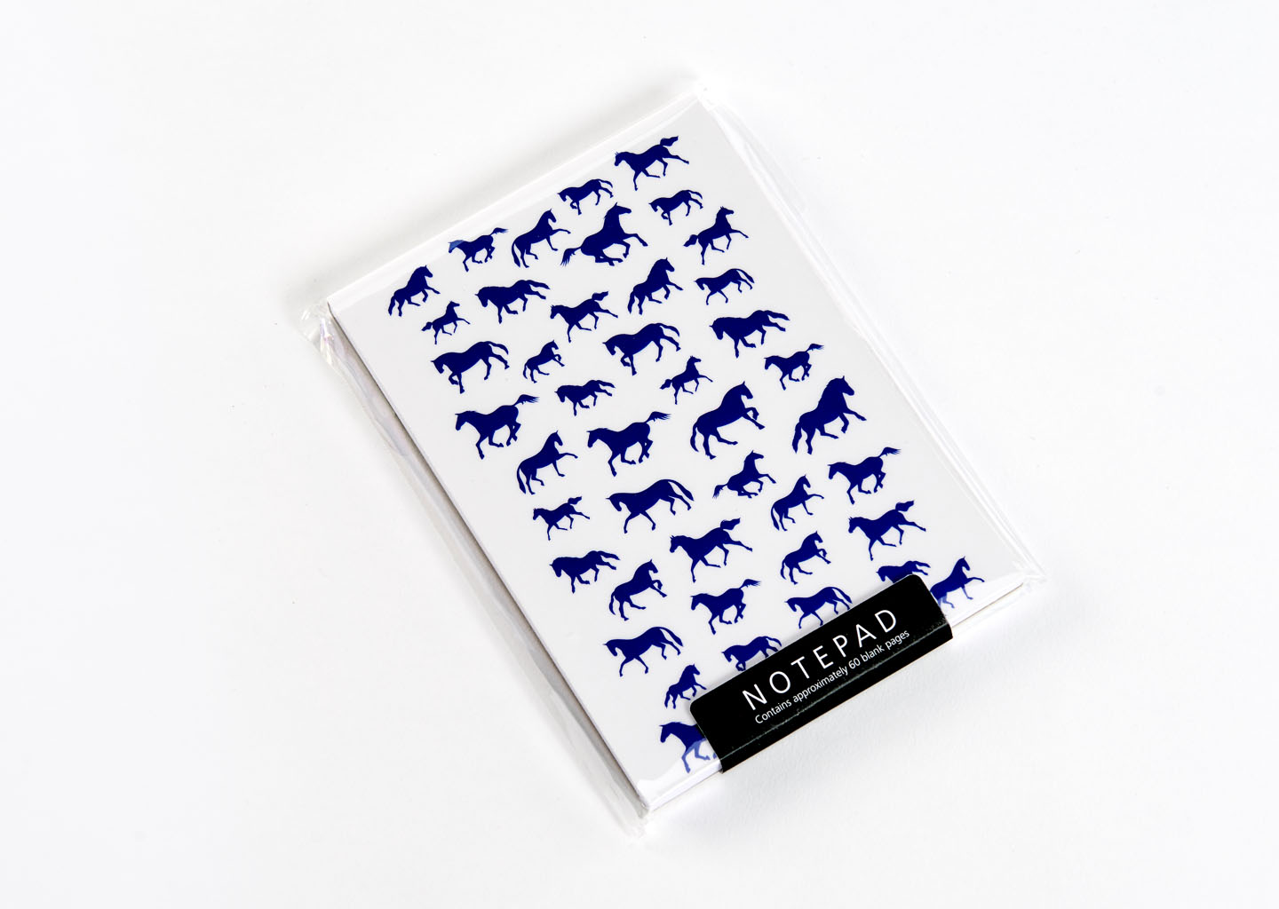
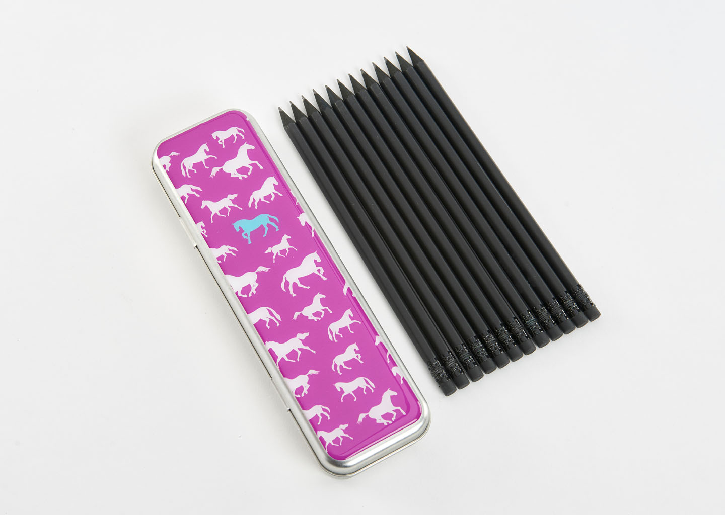
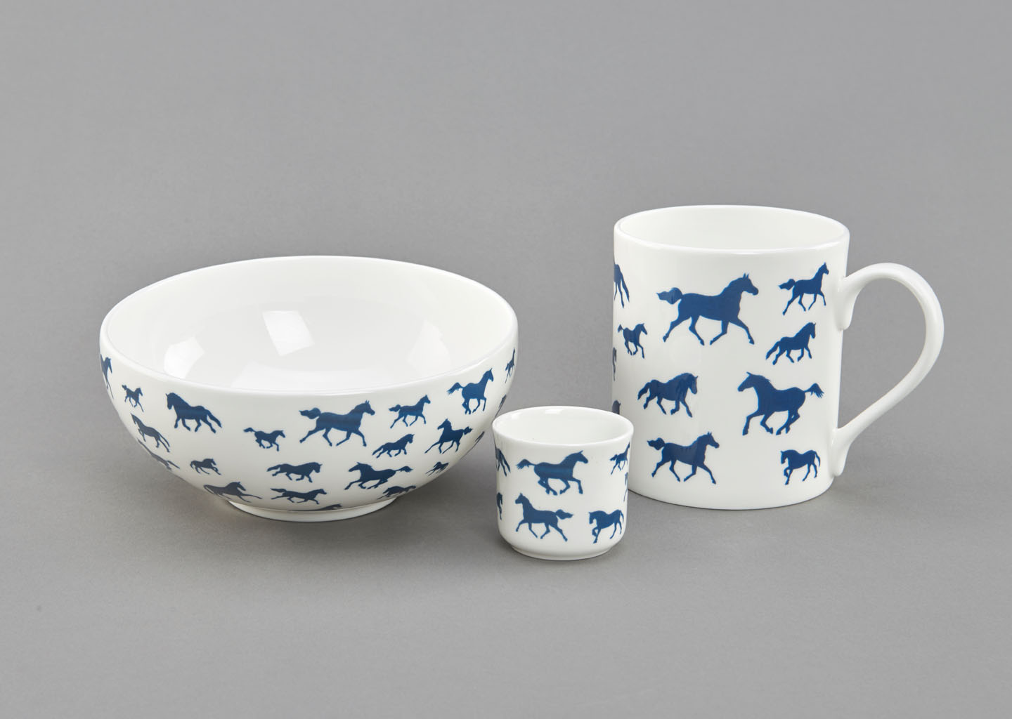
Gubblecote, an emerging gifts business within the Equestrian industry, wanted a simple logo that presented a traditional and professional tone, but that was not visibly connected to the equine industry, with future expansion into other gift markets in mind. Artwork was then needed for several product ranges for the new business to sell!
The solution:
Starting with a serif font to set a traditional tone, I created a simple text based logo, customising the font to give a boutique feel, with the dark blue adding an air of ‘established professionalism’.
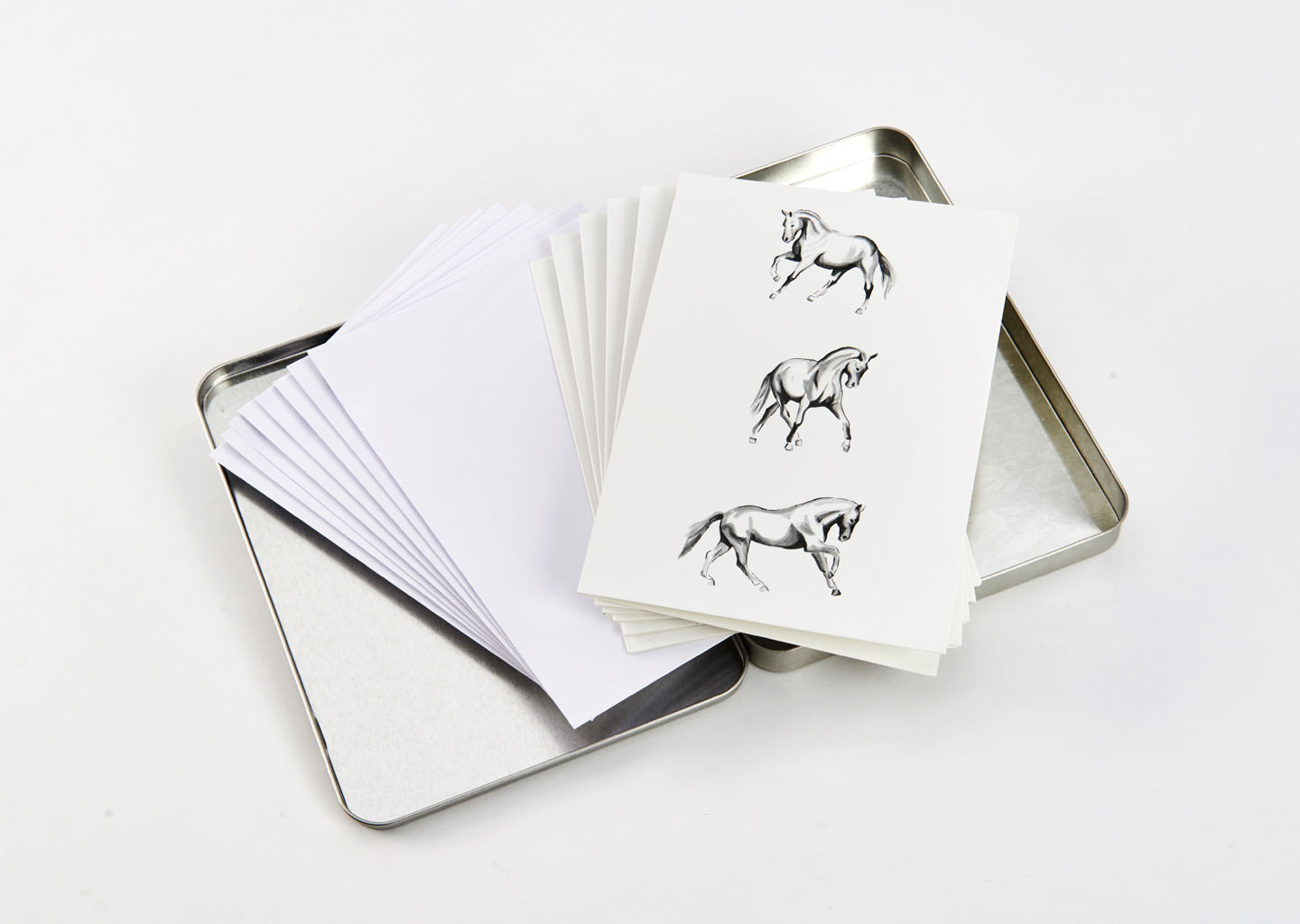
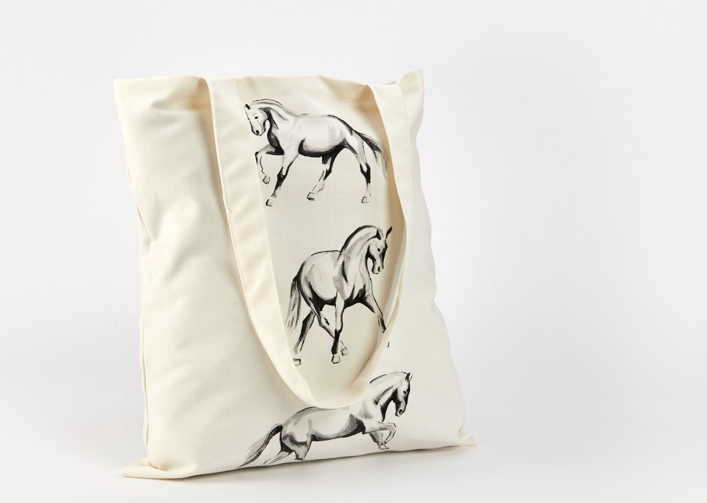
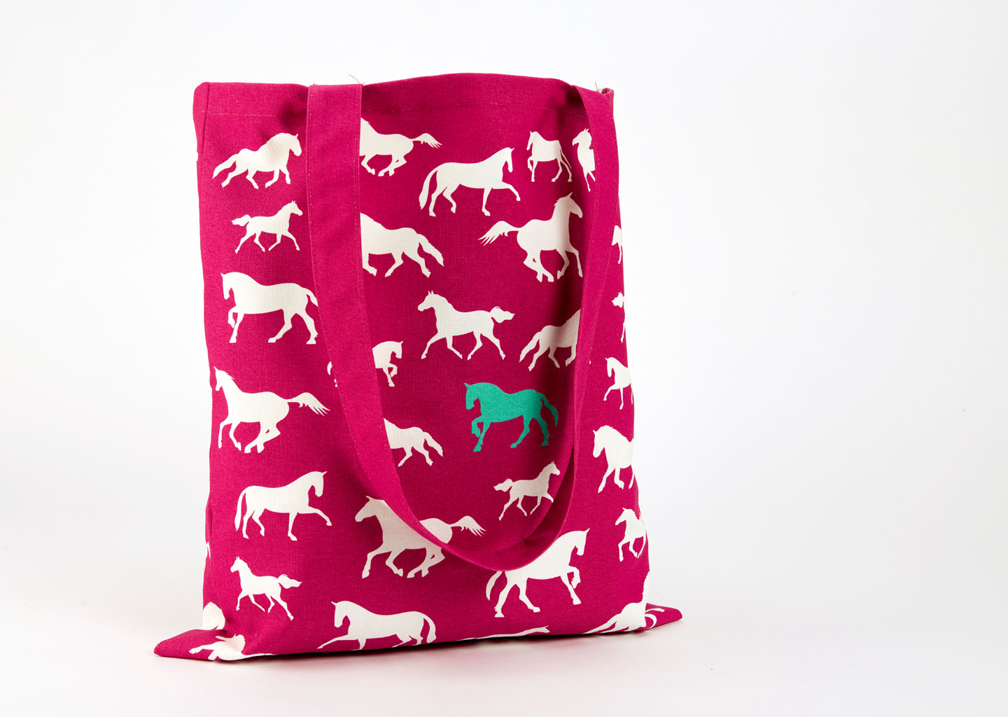
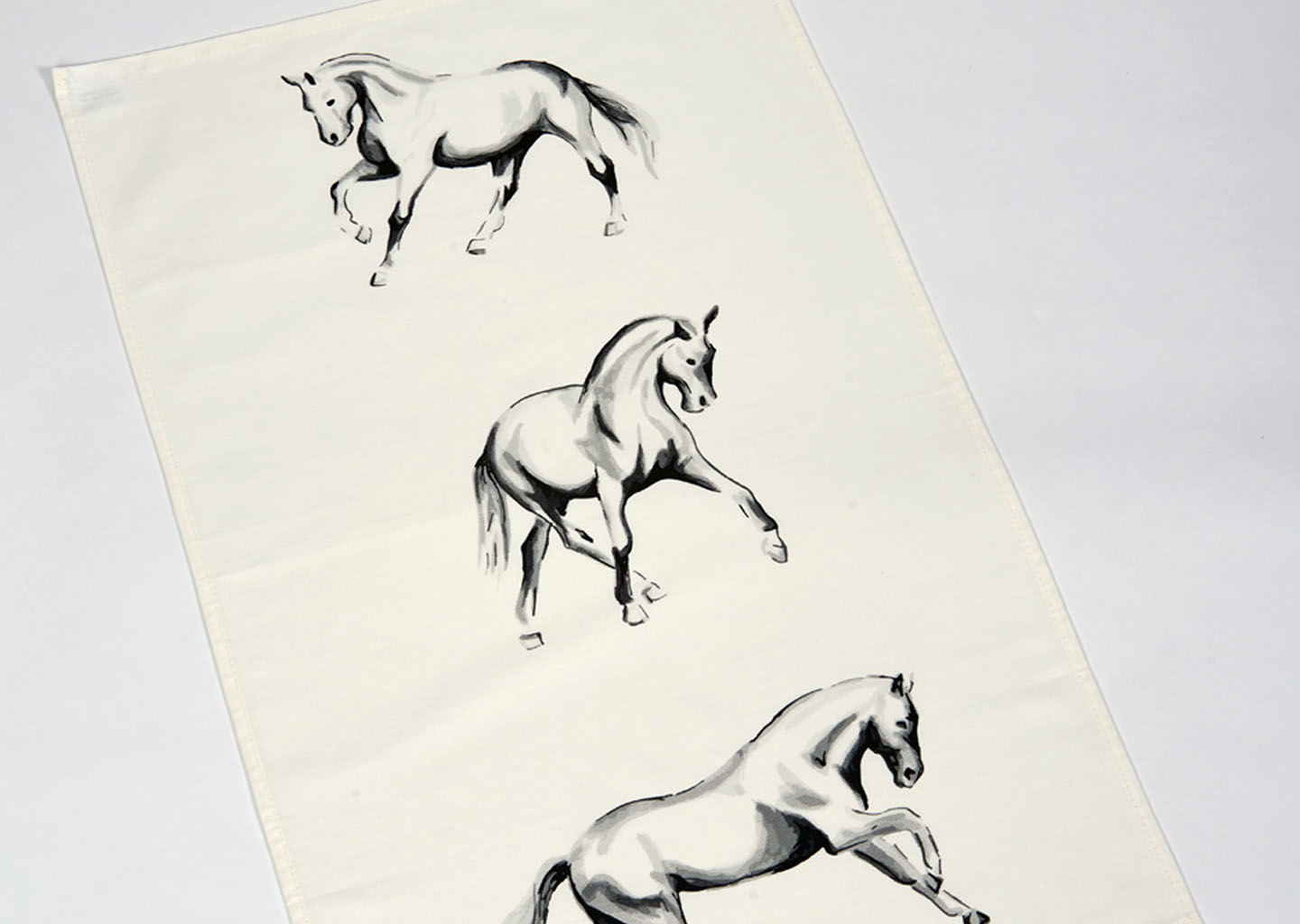
Different themes and repeating patterns were created for several product ranges, then adapted to fit specific products.
Photography courtesy of www.readphotography.co.uk
