Imtex
The brief:
Already an established IT support provider, Imtex wanted to reach out to existing and new customers with a new cloud based offering. With this new offering being at the forefront of modern technology, the client realised the importance of looking the part and so wanted to present an identity much more in keeping with the high tech nature of the services provided. One major stipulation was to avoid any obvious cloud based imagery, as they felt this had been somewhat over used by the industry already.
The solution:
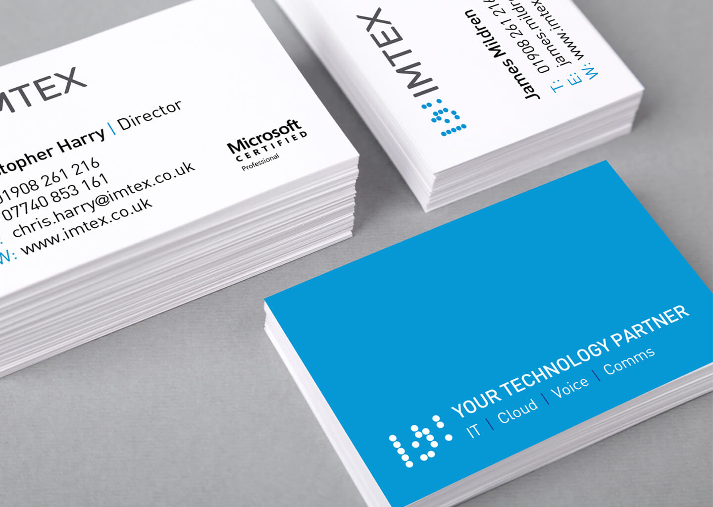
The graphic element was created from the binary code for ‘IMTEX’ – the Binary System being the most basic computer language and the building blocks of modern computing, and thus using it as a foundation of the logo was a fitting aide-memoire to the cornerstone of all computer technology.
Each letter is represented by a ‘byte’ (each horizontal line), containing 8 ‘bits’, with the off’s (the O’s) removed to show only the on’s (1’s).
A simple sans serif font was chosen to give emphasis to the graphic element, whilst also complimenting its minimal style, and giving a modern feel to the whole logo.
