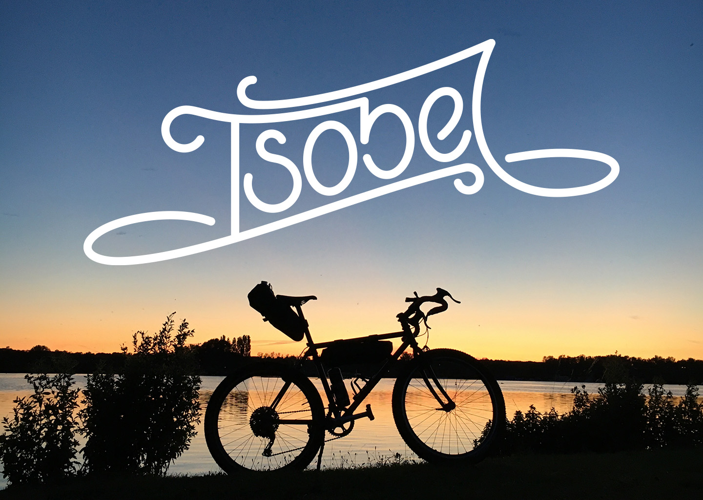
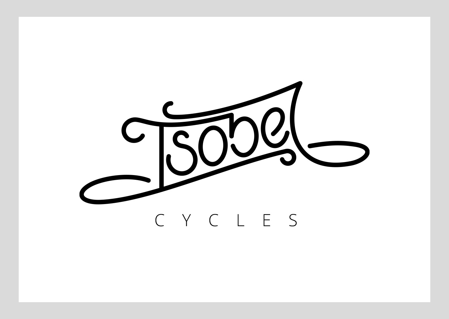
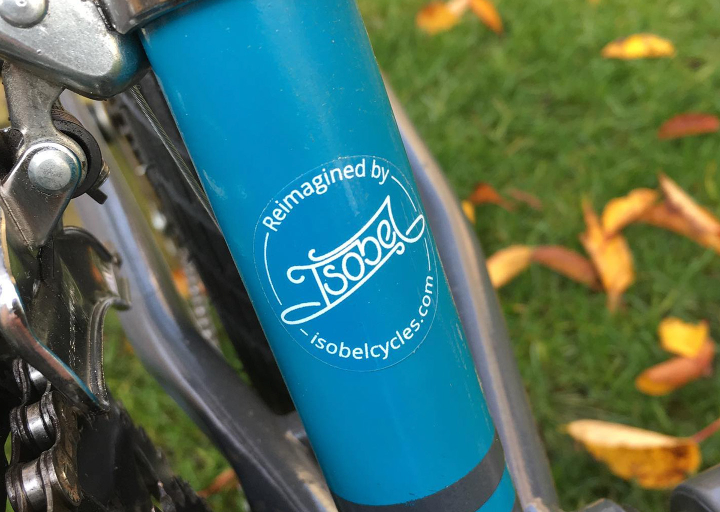
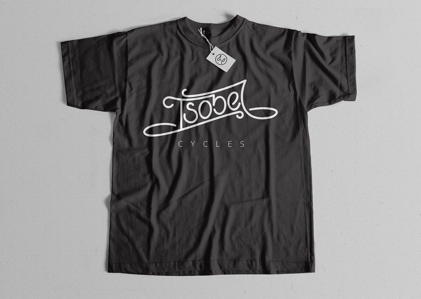
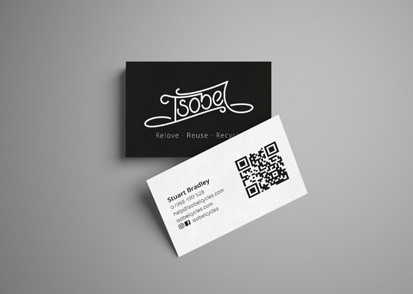
Isobel Cycles

The brief:
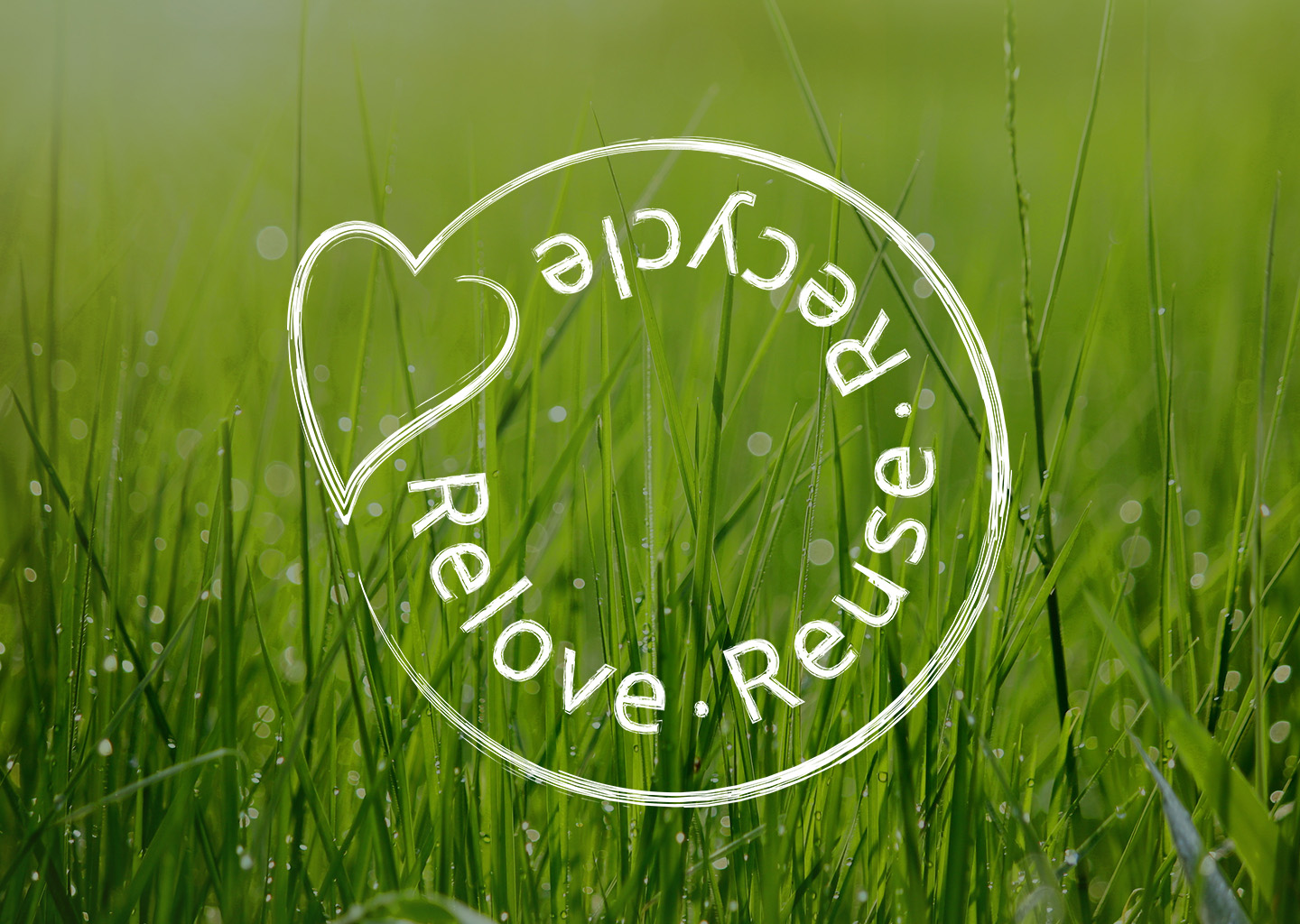
A Covid lockdown born eco business, recycling old bikes into modern adventure machines and commuters, needed a brand to properly represent the ethos of the business.

The solution:
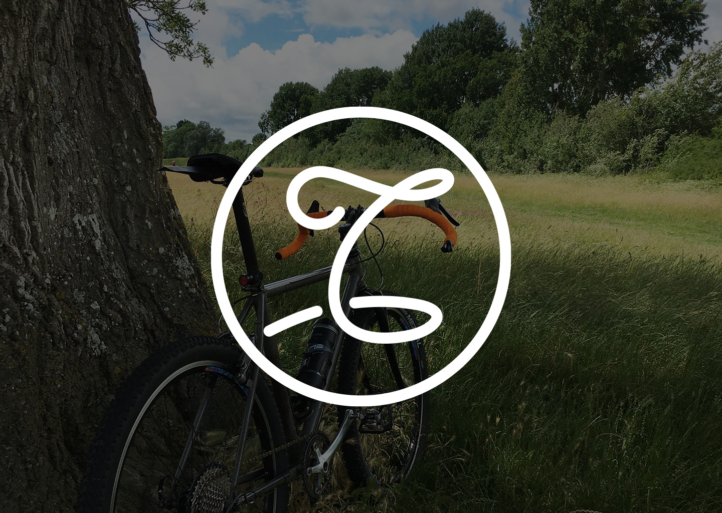
The business is named after the founders Nan, who was a keen cyclist, so I wanted to do justice to her and bring some of that personality into the brand. Completely hand drawn over several iterations, the swirling font is reminiscent of a signature and a nod to old script logos, but with a modern twist and a preciseness representing the care and attention taken to bring these old bikes back to life.

Recent Projects

Top-Skin
Visual identity
Stonbury
Visual identity
SS Landrover & Jaguar Specialists
Visual identity
Phantom Tuning
Print
Novopay
Print Visual identity
Navigate Infrastructure Consulting
Visual identity
Martine Turner
Visual identity
Isobel Cycles
Visual identity
Heliarc
Visual identity
ECG
Visual identity
Staff onboarding illustrations
Illustration
Cryselco Lighting
Visual identity
Black Stag Transport
Visual identity
Bedfordshire Police
Digital Print
Arts1
Visual identity
NHBC annual report
Print
NHBC campaign branding
Print Visual identity
Volkswagen
Illustration Print
Digital avatars
Digital Illustration
Rockwool
Digital Print
Aylesbury Prison
Digital Visual identity
Guard Environmental Consultancy
Visual identity
Youtopia
Visual identity
Modus
Visual identity
Bigbizit
Visual identity
On Call
Visual identity
Imtex
Visual identity
Staff recognition cards
Print
Zest Residential
Print Visual identity
Yellow Car Shop
Visual identity
Property Now
Visual identity
Acorn Childcare
Illustration Visual identity