NHBC annual report
The brief:
Having had the same annual report style for the last few years, the National House Building Council (NHBC) wanted a fresh style for the 2018 annual report to keep recipients interested and represent the progression of the business, whilst keeping in line with a raft of newly branded marketing materials, as well as the overarching NHBC brand.
The solution:
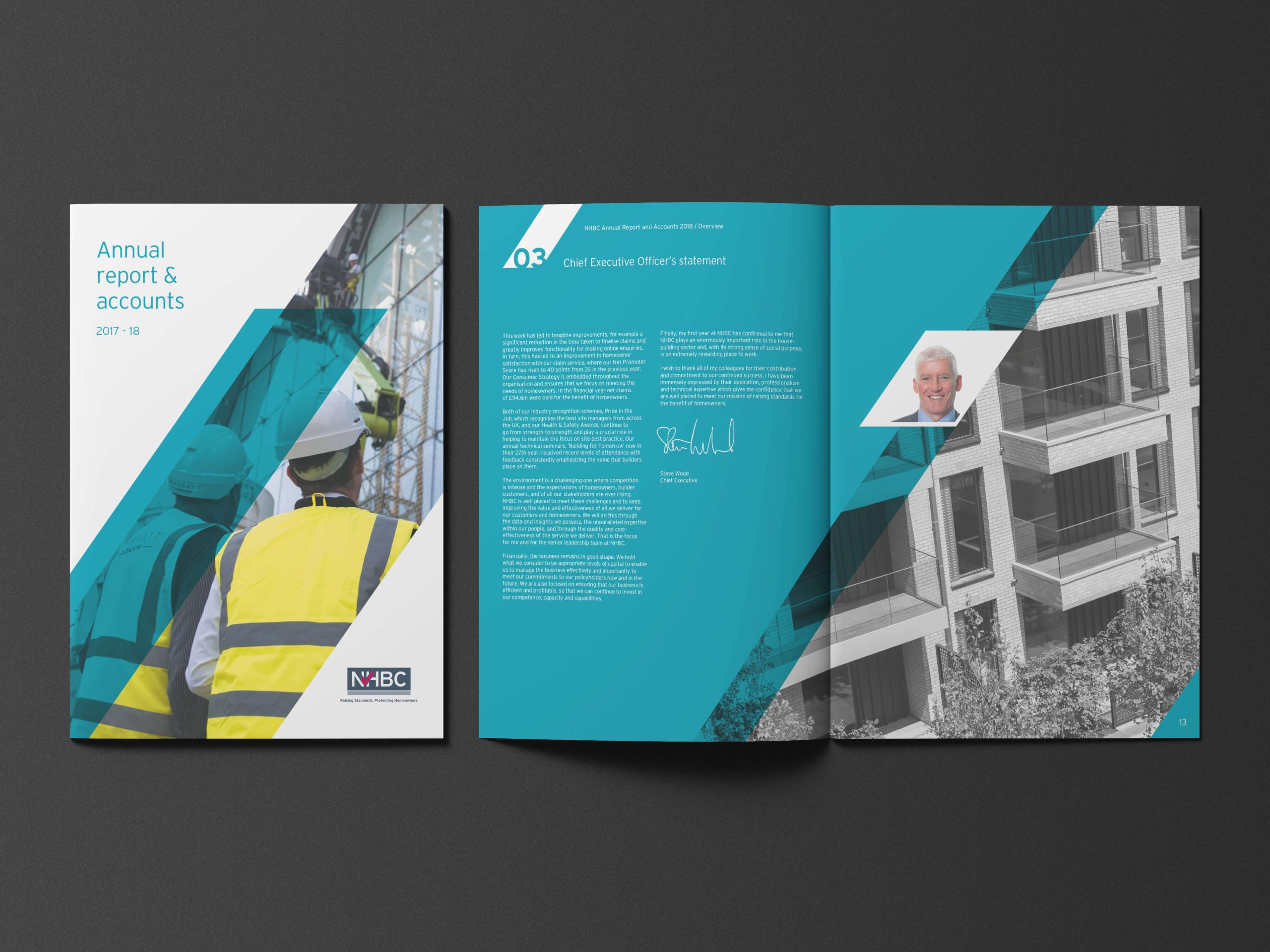
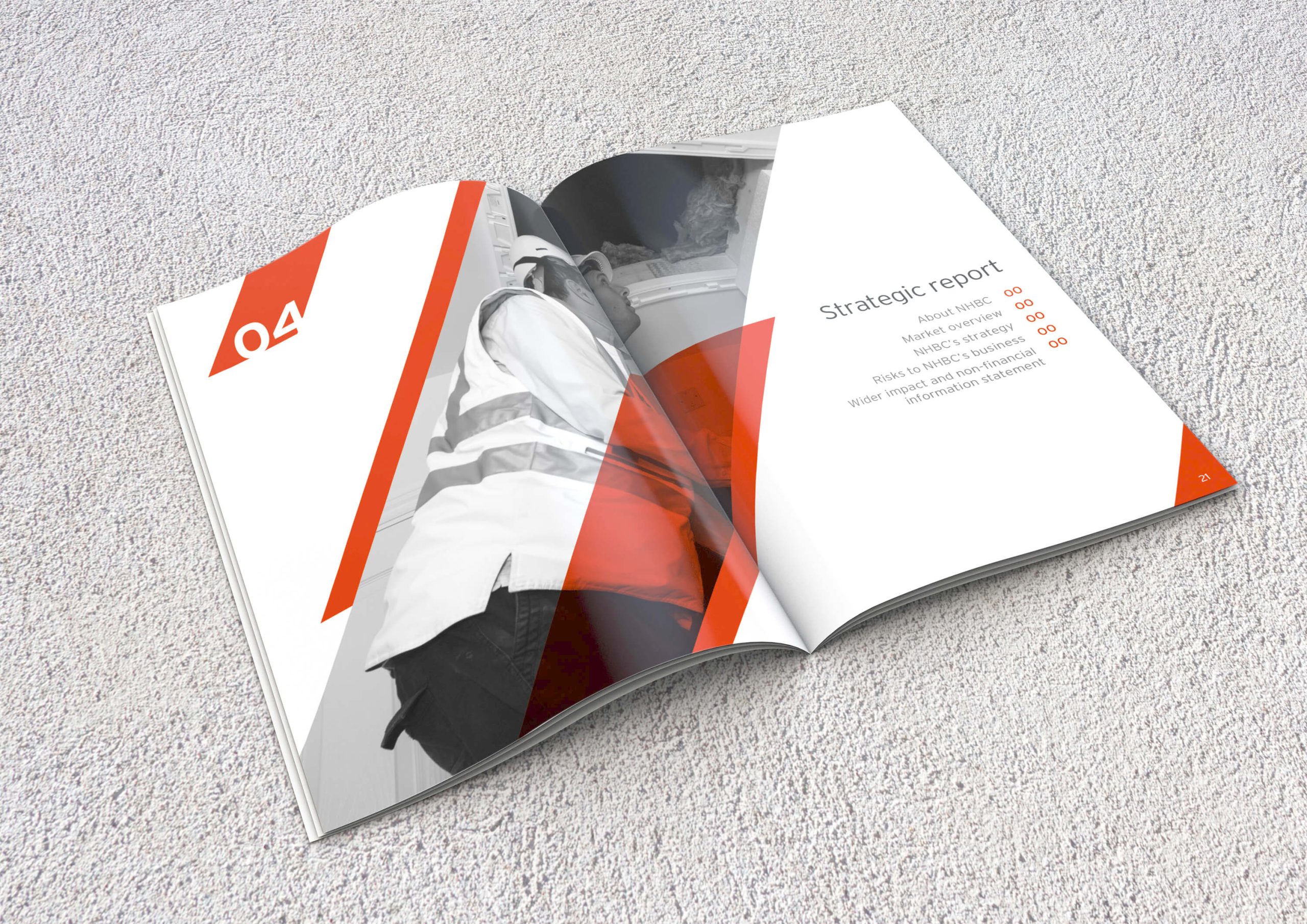
The whole design is based around the tick in the existing NHBC logo: cutting the top and bottom of the tick off to create an angled block and using this, along with lashings of white space, to create a series of colour blocks, overlays, images and background washes that developed into a bold and colourful yet structured and controlled style. This style was then developed into a series of page layouts that could be repeated throughout the annual report, with sections clearly denoted by colour.
Once the concept was approved, I then laid the initial content then managed a junior designer with amendments and image artworking.
