NHBC campaign branding

The brief:
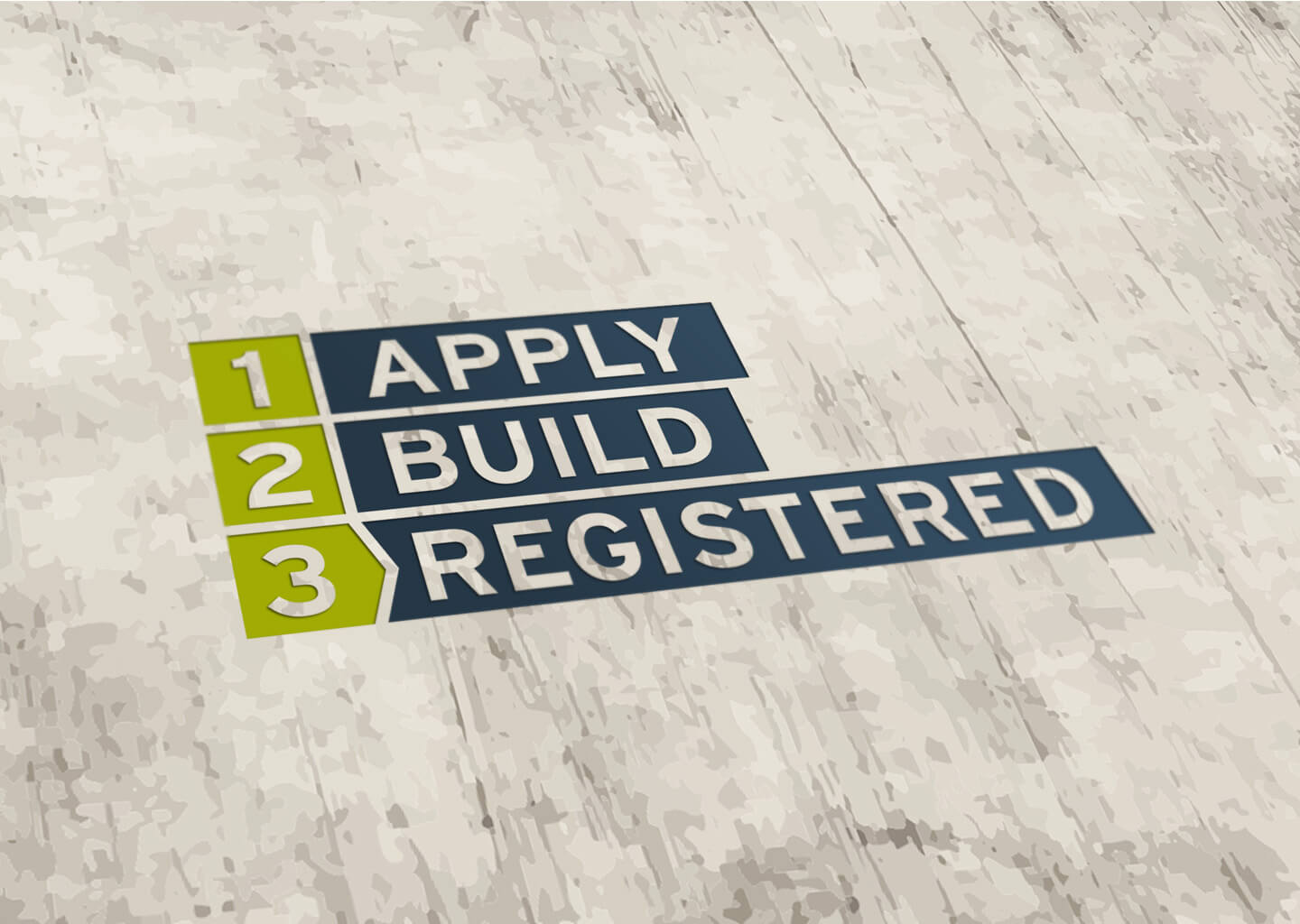
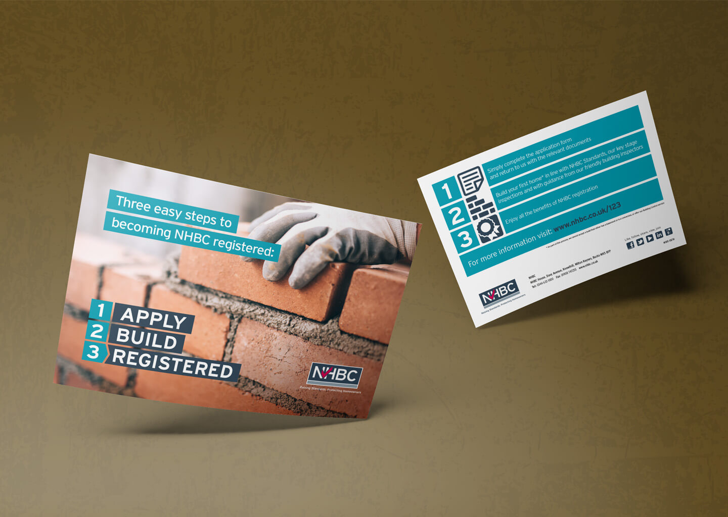
The National House Building Council (NHBC) needed some branding for a campaign to get more builders registered with them. The new campaign branding needed to highlight the 3 simple steps to register, compliment the overarching NHBC brand and work across multiple products, platforms and with different images.
The solution:
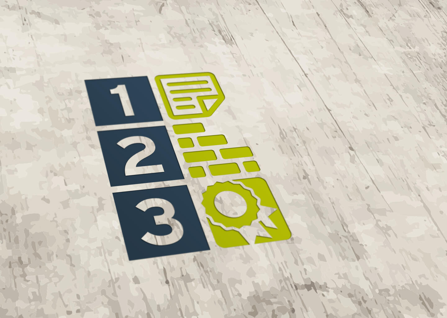
The blocky style compliments the existing NHBC logo, with the 3 steps ‘building’ the logo. The subtle arrow on the 3rd step adds some positive movement: suggestive of the positive motion of becoming registered.
Icons were developed for a shorthand version of the logo, which were also used as visual aids to compliment the 3 steps.
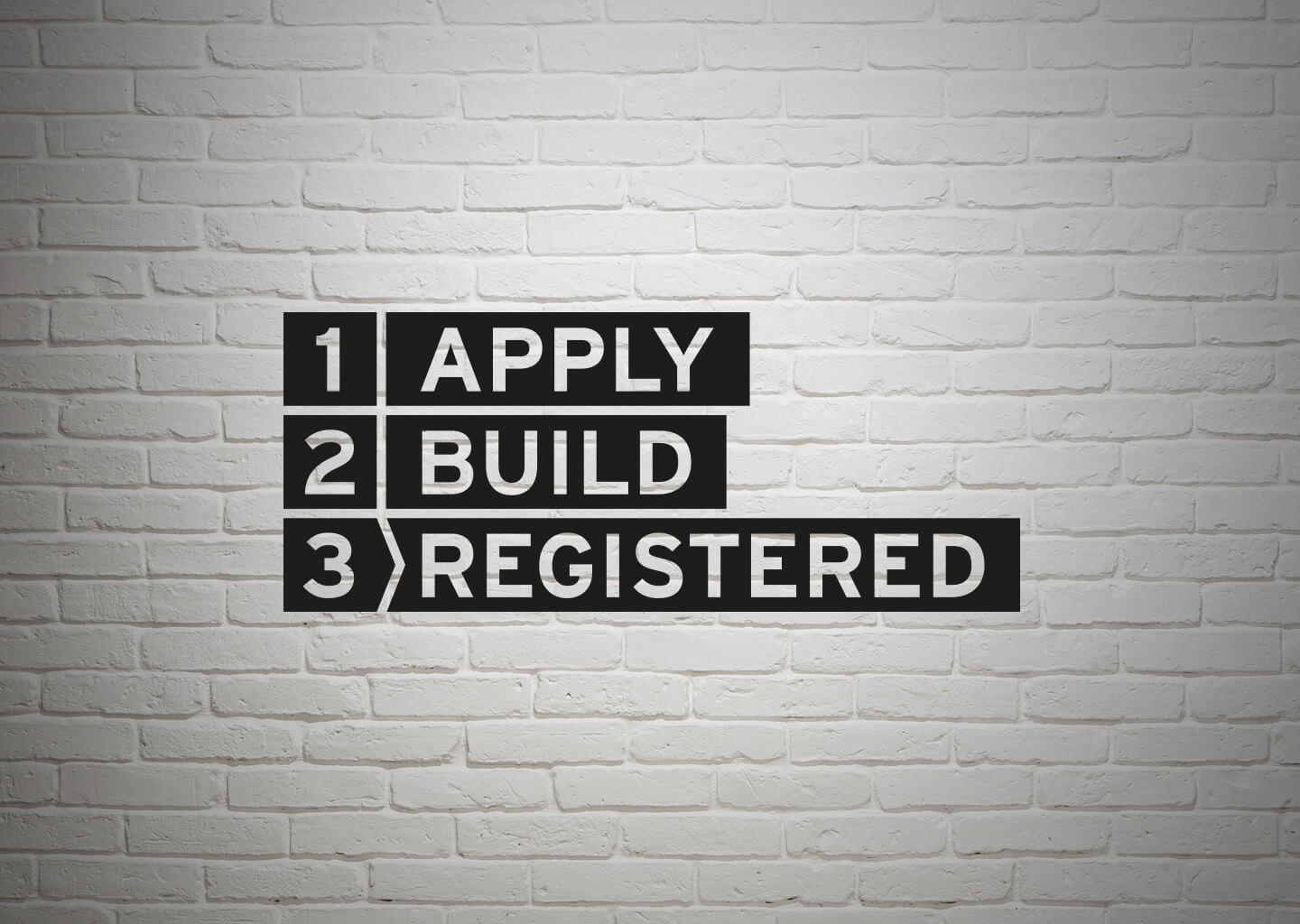
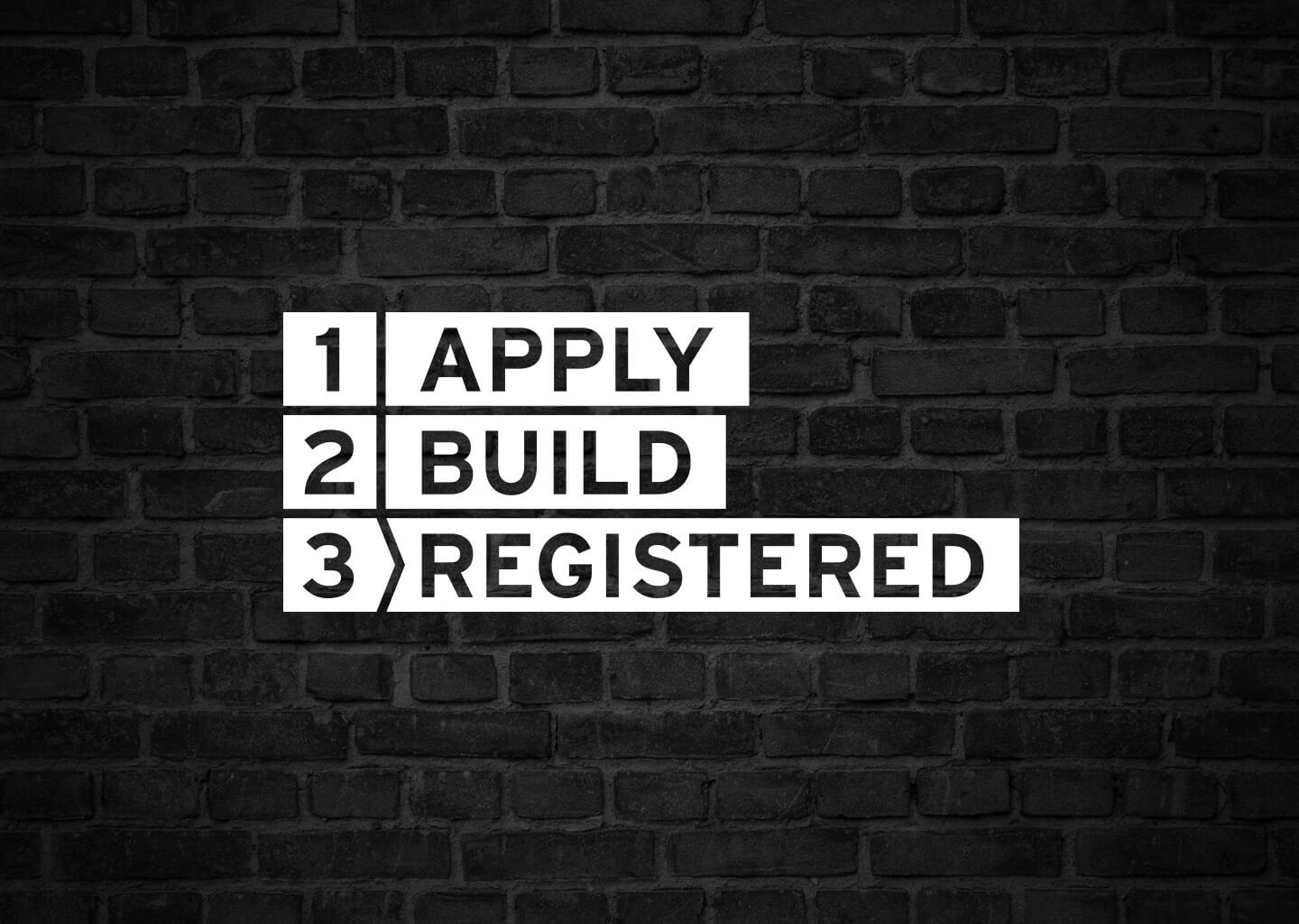
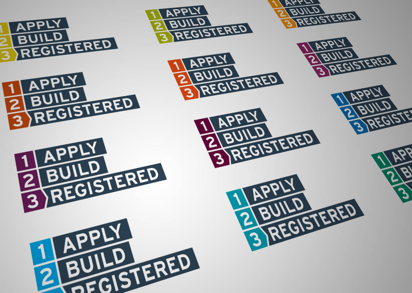
Both logos and the icons were designed without any specific colour palate, allowing them to be coloured to best suit their environment: using either NHBC’s existing palate, sampling a complimenting colour from the image it is laid over, or contrasting with its background in a block colour.
The logo and icons were then used as a style cue to develop the rest of the campaign branding across other materials.
