On Call


The brief:
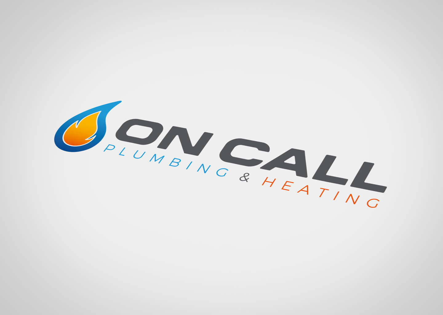
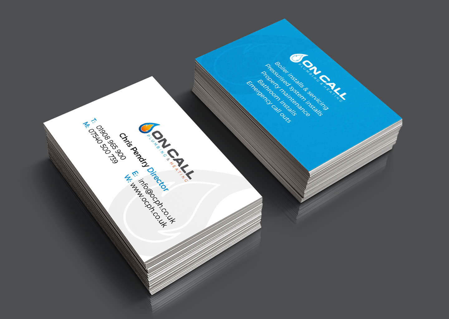
On Call Plumbing and Heating, an established plumbing company, wanted to update their image to present a more professional front to their clients and new prospects, as well as represent their own progression as a business. Offering certified services for both plumbing and heating systems, they were very keen to have something that represented both the water and heat elements of their services.
The solution:
An inclusive icon was developed, with a flame and water drop interacting with each other whilst also being separate elements in their own right. A solid sans serif font was chosen to give a modern feel, with a few subtle tweaks to compliment the smooth curves of the icon.
Colours were taken from the icon for the subline, to better tie the text element in with the icon, whilst the icon is strong enough to be used as a stand alone element, as a watermark or bullet points for example.
