Modus
The brief:
Modus provide strategic consulting, operational performance improvement, financial restructuring, executive coaching and support to hospitals, GP federations and Clinical Commissioning Groups, their USP being that they stick around to delivery the solutions they create, helping their clients become self sufficient before they leave them.
They wanted an identity that appealed to their NHS based audience, with some explanation of the unusual business name.
The solution:
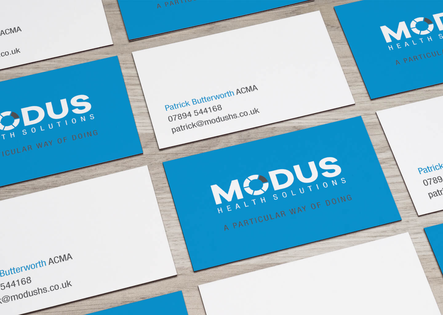
‘Modus’ is derived from the latin word of the same spelling meaning “a measure, extent, quantity”, its modern definition being “way in which anything is done”
To this end, I focused on the measurable result driven services the business offers, pulling out ‘measure’ from the Latin translation as a focus point. The ‘O’ was replaced with a stylised pie chart as a symbol of statistical measurement, and a strapline was developed as both a descriptor of the businesses services, and an interchangeable introduction into any one of the services on offer eg: “a particular way of doing… strategic consulting”
The blue was chosen as the main colour for its links with the NHS branding, and its positive psychological properties of: intelligence, trust, communication and efficiency– all necessary attributes needed by the business.
The ‘O’/pie chart can also be used as a stand alone icon for social media, or a graphic asset in other marketing products.
From first contact through to completion I have been impressed by your professionalism and the quality of you work. You quickly understood what was required, the desired brand values and the need for rapid delivery. You kept us informed about progress and met the tight deadlines while still delivering an excellent product. You have been a pleasure to work with and I would not hesitate to refer our clients to you for design work in the future.
Patrick Butterworth, Modus Health Solutions
