Stonbury

The brief:
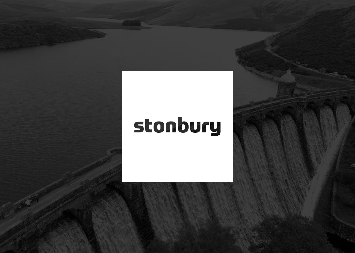
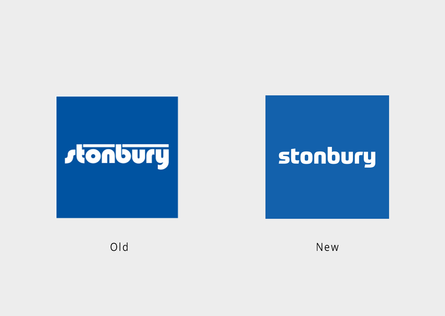
Stonbury is a specialist contractor working with most of the UK’s water companies, and the Environment Agency, to deliver high value, low carbon solutions. Having had the same logo since their incorporation in 1983, it was time for a refresh! But the client did not want a complete departure, rather a ‘journey’ from the old to a new eventual identity.

The solution:
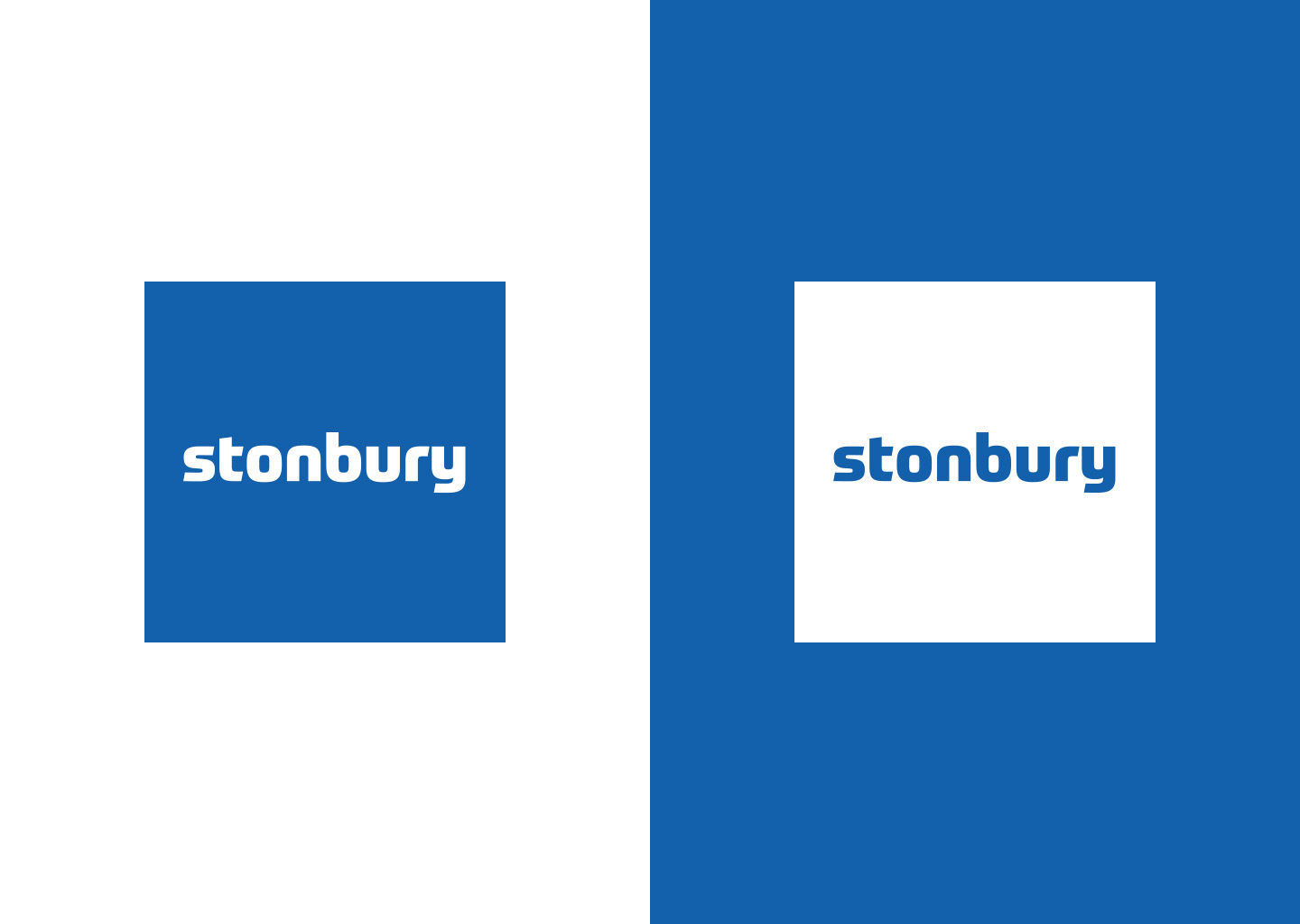
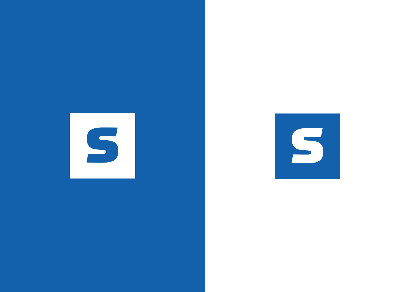
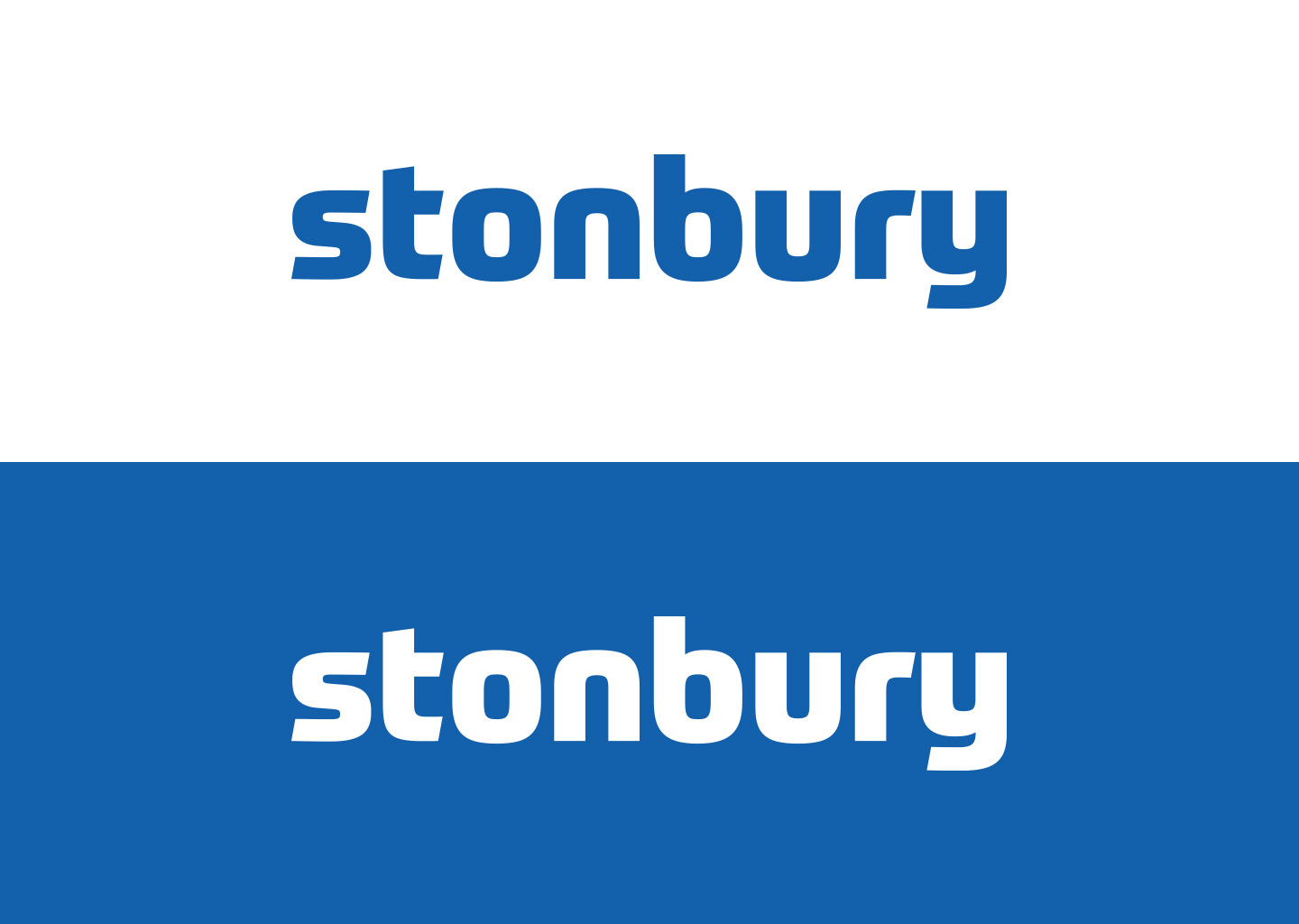
Working within a very tight brief, I carried over the very easily identified blue block and white lowercase text. I used a more modern font that still possessed the solidity of the old font but with more standard characters that are easier to read. The ‘s’ has a similar flow to the original but with more definition. I also paid particular care to the spacing withing the blue block, presenting the word in its standard sentence spacing, to further aid easy reading.

And then Covid struck, and the project was paused at the logo, so watch this space…

Recent Projects

Top-Skin
Visual identity
Stonbury
Visual identity
SS Landrover & Jaguar Specialists
Visual identity
Phantom Tuning
Print
Novopay
Print Visual identity
Navigate Infrastructure Consulting
Visual identity
Martine Turner
Visual identity
Isobel Cycles
Visual identity
Heliarc
Visual identity
ECG
Visual identity
Staff onboarding illustrations
Illustration
Cryselco Lighting
Visual identity
Black Stag Transport
Visual identity
Bedfordshire Police
Digital Print
Arts1
Visual identity
NHBC annual report
Print
NHBC campaign branding
Print Visual identity
Volkswagen
Illustration Print
Digital avatars
Digital Illustration
Rockwool
Digital Print
Aylesbury Prison
Digital Visual identity
Guard Environmental Consultancy
Visual identity
Youtopia
Visual identity
Modus
Visual identity
Bigbizit
Visual identity
On Call
Visual identity
Imtex
Visual identity
Staff recognition cards
Print
Zest Residential
Print Visual identity
Yellow Car Shop
Visual identity
Property Now
Visual identity
Acorn Childcare
Illustration Visual identity