Bigbizit

The brief:
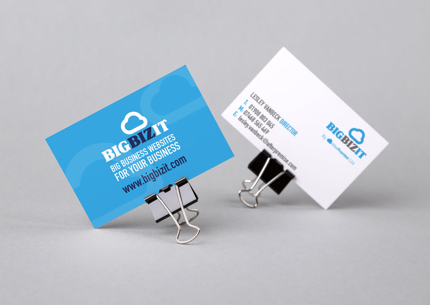
Having created their own logo in-house when starting the business, web development agency BigBizIT wanted to refresh it’s brand identity, in line with its own growth and development. Happy with the basics of its existing logo, only a polish was required, but they then needed a new brand identity creating around the logo, that would then be rolled out over several other marketing materials.
The solution:
With old school weather charts very much in mind, the existing icon was completely redrawn, using circles to create a ‘perfect’ cloud. The resulting shape was given a chunky outline to give it a modern, playful feel, complimented perfectly with a super chunky font. Existing colours were maintained to keep some consistency with the old design, with several colour-ways created to work with the simple 3 colour palate.
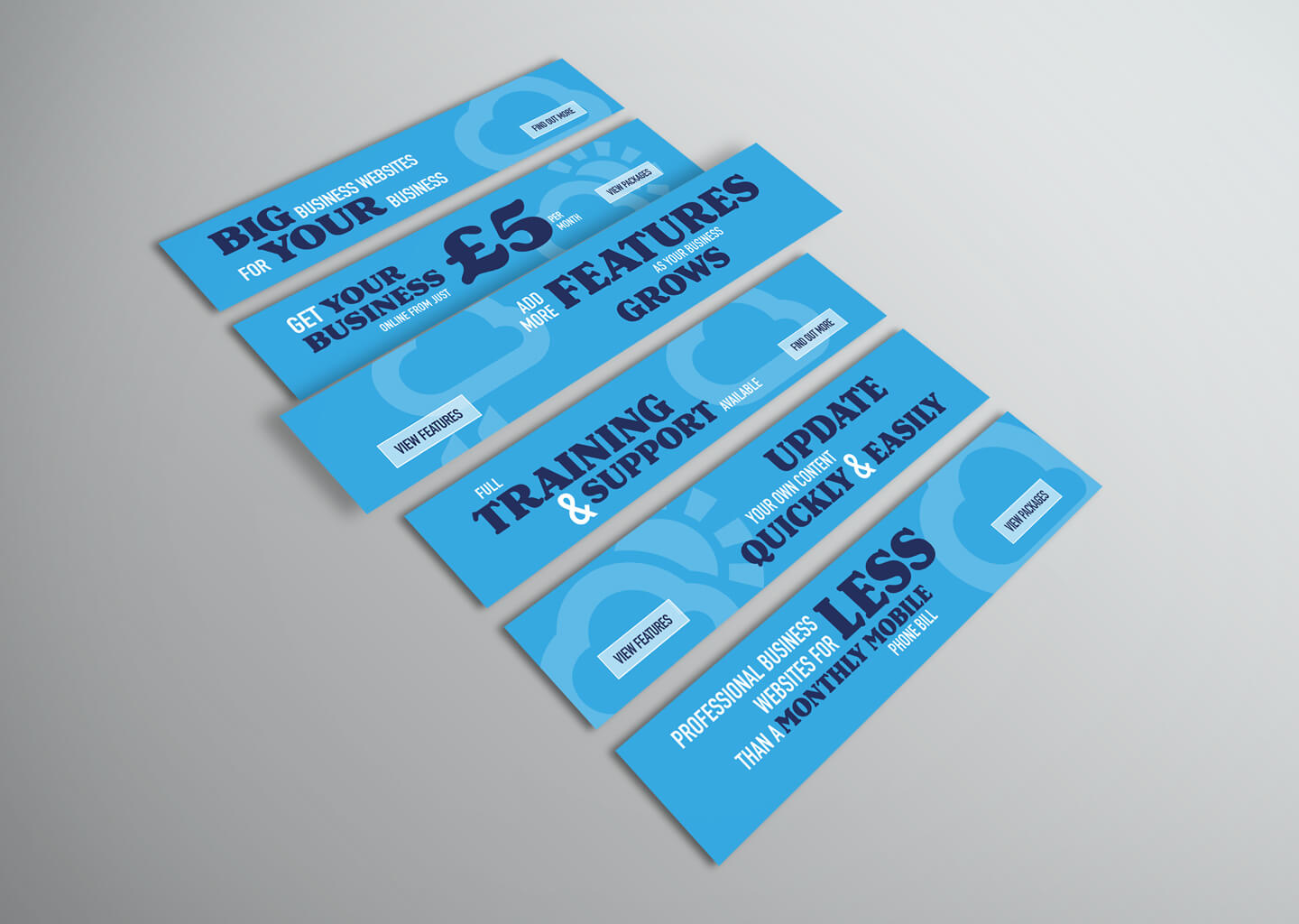
The final logo gave definite design cues for a clean a simple ‘joined up’ brand identity across printed and digital media: a set of supporting icons was developed to help highlight sales points, and for use as design assets to further reinforce the brand identity across items from business cards to exhibition materials to web banners.
